Who is this for?
Beginner & Intermediate Developers looking to level up their React Native skills and build production-ready, full-stack mobile applications.
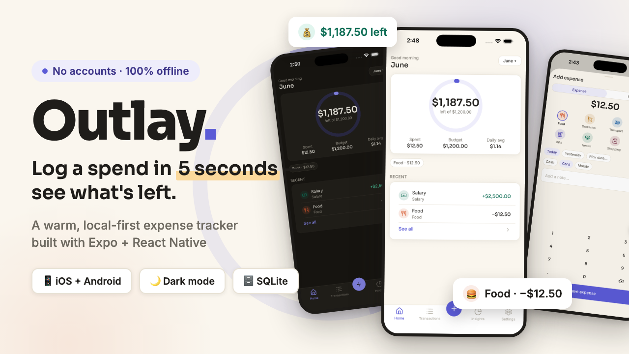
Outlay — a complete expense tracker app for iOS AND Android
Outlay is a warm, calm, local-first expense tracker for iOS and Android, built with Expo (React Native). Log spending in under 5 seconds and instantly see what's left of your monthly budget — no bank links, no sign-ups, no network calls. All data stays on your device. SQLite on-device, no analytics, no accounts, offline forever Tech stack: Expo Router · TypeScript (strict) · NativeWind v4 · expo-sqlite · Zustand · Reanimated · Lucide icons
Technologies Used
Key Features
- 🎯 Budget ring — one hero element on Home showing exactly what's left this month, with warning/danger states as you approach the limit
Who is this for?
Beginner & Intermediate Developers looking to level up their React Native skills and build production-ready, full-stack mobile applications.
Starter Docs & Prompts
Everything you need to kick off this project — copy the master prompt or setup docs below and use them directly in your editor or AI assistant.
Save this as CLAUDE.md in your project root so Claude Code follows the project's setup and conventions.
CLAUDE.md — Outlay
This file is the binding contract for building Outlay. It wins over any other instruction, including the master prompt, on any conflict. Read it fully before writing a single line of code. Copy it to the project root as the first commit.
1. Project overview
- App name: Outlay
- One-liner: A warm, calm, local-first expense tracker — log spending in under 5 seconds, see exactly what's left this month.
- Platforms: iOS + Android, Expo managed workflow (no bare/prebuild customization, no config plugins beyond what Expo supports out of the box).
- Data: Local-first.
expo-sqliteis the single source of truth. No accounts, no network calls, no analytics. Architecture must keep a clean repository layer (src/db/queries/*) so a sync engine can be added later without touching screens. - Auth: None.
- Dark mode: Required from day one. Every screen must be built and verified in both modes.
2. Design provenance (researched on Mobbin, June 2026)
| Decision | Borrowed from | Mobbin rating |
|---|---|---|
| Warm cream canvas, indigo primary, kind copy voice | YNAB | 5.0 |
| White card system, semantic income/expense colors, time-range chips, confetti success moment | Monarch | 4.67 |
| Full-width bottom-anchored primary CTA, "use before you sign up" (we go further: no signup at all) | Copilot Money | 5.0 |
| Budget progress ring as the single hero element on Home | Rocket Money | 4.33 |
| Anti-patterns to avoid (both rated 4.33 — lowest in the research set): dense multi-widget dashboards, red gradient surfaces, gamified badge clutter (Rocket Money); ALL-CAPS shouty marketing copy, upsell carousels, >2 onboarding interstitials (Cleo) | — | — |
3. Design tokens (copy-paste, do not modify values)
Create src/theme/tokens.ts with exactly this object. No inline magic numbers anywhere in the app — every color, size, radius, duration must come from these tokens (via Tailwind classes or this object).
export const palette = {
  light: {
    bg: '#FAF6EE',
    surface: '#FFFFFF',
    surfaceSunken: '#F2EDE2',
    text: '#1F1D1A',
    textMuted: '#6E6A61',
    textFaint: '#B4B0A5',
    border: '#E8E2D5',
    primary: '#5B5BD6',
    primaryPressed: '#4A4AC4',
    primarySoft: '#EEEDFB',
    onPrimary: '#FFFFFF',
    income: '#0F6E56',
    incomeSoft: '#E1F5EE',
    expense: '#993C1D',
    expenseSoft: '#FAECE7',
    warning: '#BA7517',
    warningSoft: '#FAEEDA',
    danger: '#A32D2D',
    dangerSoft: '#FCEBEB',
    ringTrack: '#EEEDFB',
    overlay: 'rgba(31, 29, 26, 0.45)',
  },
  dark: {
    bg: '#171511',
    surface: '#211F1A',
    surfaceSunken: '#1B1916',
    text: '#F2EFE6',
    textMuted: '#A39E92',
    textFaint: '#6E6A61',
    border: '#35322B',
    primary: '#8585E8',
    primaryPressed: '#9B9BF0',
    primarySoft: '#2B2A45',
    onPrimary: '#171511',
    income: '#4ECBA0',
    incomeSoft: '#11332A',
    expense: '#F0997B',
    expenseSoft: '#3A241B',
    warning: '#FAC775',
    warningSoft: '#33270F',
    danger: '#F09595',
    dangerSoft: '#3A1A1A',
    ringTrack: '#2B2A45',
    overlay: 'rgba(0, 0, 0, 0.6)',
  },
} as const;

export const typography = {
  // Sora = display/headings/money. Inter = body/labels.
  display:   { fontFamily: 'Sora_600SemiBold',  fontSize: 32, lineHeight: 38 }, // big money figures
  h1:        { fontFamily: 'Sora_600SemiBold',  fontSize: 28, lineHeight: 34 },
  h2:        { fontFamily: 'Sora_500Medium',    fontSize: 22, lineHeight: 28 },
  h3:        { fontFamily: 'Sora_500Medium',    fontSize: 17, lineHeight: 24 },
  body:      { fontFamily: 'Inter_400Regular',  fontSize: 15, lineHeight: 22 },
  bodyMedium:{ fontFamily: 'Inter_500Medium',   fontSize: 15, lineHeight: 22 },
  label:     { fontFamily: 'Inter_500Medium',   fontSize: 13, lineHeight: 18 },
  caption:   { fontFamily: 'Inter_400Regular',  fontSize: 13, lineHeight: 18 },
  micro:     { fontFamily: 'Inter_500Medium',   fontSize: 11, lineHeight: 14 },
  moneyRow:  { fontFamily: 'Sora_500Medium',    fontSize: 15, lineHeight: 22 }, // amounts in list rows
} as const;

export const spacing = { 1: 4, 2: 8, 3: 12, 4: 16, 5: 20, 6: 24, 7: 28, 8: 32, 10: 40, 12: 48 } as const; // 4pt scale

export const radius = { sm: 8, md: 12, lg: 16, xl: 24, pill: 999 } as const;

export const shadows = {
  card:  { shadowColor: '#1F1D1A', shadowOpacity: 0.08, shadowRadius: 8,  shadowOffset: { width: 0, height: 2 }, elevation: 2 },
  sheet: { shadowColor: '#1F1D1A', shadowOpacity: 0.16, shadowRadius: 24, shadowOffset: { width: 0, height: 8 }, elevation: 8 },
} as const; // only these two levels exist — nothing else gets a shadow

export const motion = {
  fast: 150, base: 250, slow: 400,             // ms, with easeOutCubic
  spring: { damping: 18, stiffness: 220 },     // reanimated spring for presses/sheets
  ringMount: 800,                              // home ring fills 0 → value on mount, easeOutCubic
} as const;
Mirror palette and the pixel scales into tailwind.config.js (theme.extend.colors with light-bg, dark-bg, etc. or via CSS variables + darkMode: 'class' strategy NativeWind supports). Tailwind config and tokens.ts must never disagree; tokens.ts is canonical.
4. Fonts
Packages: @expo-google-fonts/sora, @expo-google-fonts/inter, expo-font, expo-splash-screen.
Load in the root layout exactly like this and keep the splash screen up until ready:
import { useFonts, Sora_500Medium, Sora_600SemiBold } from '@expo-google-fonts/sora';
import { Inter_400Regular, Inter_500Medium } from '@expo-google-fonts/inter';

const [fontsLoaded] = useFonts({
  Sora_500Medium, Sora_600SemiBold, Inter_400Regular, Inter_500Medium,
});
// SplashScreen.preventAutoHideAsync() at module scope; hide when fontsLoaded && db ready.
Only these 4 font weights exist in the app. Never request others.
5. Component rules (exact values — no deviation)
| Component | Spec |
|---|---|
| Button / primary | Height 52, radius 16, bg primary, text onPrimary 15px Inter_500Medium. Pressed: bg primaryPressed + scale 0.98 (spring). Disabled: 40% opacity. Full-width, anchored above safe-area bottom inset + 16 on forms (Copilot pattern). |
| Button / secondary | Height 52, radius 16, bg surface, 1px border border, text text. |
| Button / destructive | Height 52, radius 16, bg dangerSoft, text danger. Always behind a confirm dialog. |
| Button / small | Height 36, radius 12, padding-x 16, 13px Inter_500Medium. |
| Card | bg surface, radius 16, padding 16, shadow card, 1px border border (border only in light mode; dark mode relies on surface contrast, border border at 50% opacity). |
| Input | Height 52, radius 12, bg surface, 1px border border, focus border primary (2px), text 15px Inter_400Regular, placeholder textFaint. Error state: border danger + 13px caption below in danger. |
| Chip (category/filter) | Height 32, radius pill, padding-x 12, 13px Inter_500Medium. Unselected: bg surface, border border, text textMuted. Selected: bg primarySoft, text light #3C3489 / dark #C9C9F5, no border. Press = haptic selection tick. |
| List row (transaction) | Height 64, padding-x 16. Left: 36px circle, bg category-color-soft, lucide icon 18px category color. Middle: title 15px text + caption 13px textMuted. Right: amount in moneyRow type — expenses plain text with "−", income income with "+". Pressed: bg surfaceSunken. Separated by 1px border inset 16 left. |
| Progress ring (Home hero) | 168px diameter, 12px stroke, round caps. Track ringTrack, fill primary; fill switches to warning at ≥85% of budget and danger/expense at >100%. Center: remaining amount in display type + caption "left of {budget}". Animates 0 → value in 800ms on mount. |
| Category bar (Insights) | 8px height, radius pill, track ringTrack, fill = category color. |
| Tab bar | Height 64 + bottom safe area, bg surface, top 1px border border. 4 tabs (lucide icons 24px): active primary, inactive textFaint, 11px micro labels. Center FAB: 56px circle, bg primary, white plus icon 24px, floats 16px above bar, shadow sheet, press = scale 0.9 spring + medium haptic. |
| Modal sheet | Slides from bottom, top radius 24, bg bg, grabber 36×4 radius pill border centered 8px from top, backdrop overlay. Full-height for Add expense; auto-height for pickers. |
| Empty state | Centered: lucide icon 48px textFaint, h3 title, body textMuted max 2 lines, optional small button. Copy is warm, never guilt-inducing (YNAB voice). |
| Section header | 13px label type, textMuted, uppercase tracking +0.5, margin top 24 bottom 8. |
| Toast/confirm | Use native Alert for destructive confirms; custom toast: card style, bottom-floating, auto-dismiss 2.5s. |
6. Code conventions
- TypeScript strict (
"strict": true), noany, no@ts-ignore. - Expo Router (file-based) — file tree in §8 is fixed; do not rename routes.
- Styling: NativeWind v4 (Tailwind classes). StyleSheet only where NativeWind can't express it (SVG props, animated styles).
- State: Zustand for UI state (selected month, theme override); SQLite is the source of truth for data. Data access only through hooks in
src/hooks/which callsrc/db/queries/*. Screens never import the db client directly. - Money: stored as integer minor units (
amountMinor), formatted withIntl.NumberFormatviasrc/lib/currency.ts. Never float math on money. - Dates:
dayjsonly, ISO 8601 strings in DB, month keys asYYYY-MM. All date logic insrc/lib/dates.ts. - Icons:
lucide-react-nativeonly. - Animation:
react-native-reanimatedonly. Haptics viaexpo-hapticswrapped insrc/lib/haptics.ts. - IDs:
expo-cryptorandomUUID. - No inline magic numbers. Pixel values come from Tailwind scale/tokens; colors only from tokens.
- Components ≤150 lines; extract when bigger. One component per file.
7. Data model
// src/db/types.ts — exported, canonical
export type TxType = 'expense' | 'income';
export type Account = 'cash' | 'card' | 'mobile';

export interface Category {
  id: string;            // uuid
  name: string;
  icon: string;          // lucide icon name, e.g. 'utensils'
  color: string;         // hex from the fixed category palette below
  type: TxType;
  sortOrder: number;
  isArchived: 0 | 1;
}

export interface Transaction {
  id: string;
  type: TxType;
  amountMinor: number;   // integer, e.g. 1250 = 12.50
  categoryId: string;
  account: Account;
  note: string;          // '' allowed
  occurredAt: string;    // ISO datetime
  createdAt: string;
  updatedAt: string;
}

export interface Budget {
  id: string;
  categoryId: string | null; // null = overall monthly budget
  amountMinor: number;
  // applies to every month until changed (single active row per category)
}

export interface Setting { key: string; value: string; }
// keys used: 'currencyCode' (default 'USD'), 'theme' ('system'|'light'|'dark'),
// 'reminderTime' ('' or 'HH:mm'), 'onboardingDone' ('0'|'1')
SQL tables mirror these 1:1 (categories, transactions, budgets, settings), created in src/db/migrations.ts with a PRAGMA user_version migration pattern. Index: transactions(occurredAt), transactions(categoryId).
Seed categories (inserted on first run): Food #D85A30/utensils, Groceries #BA7517/shopping-cart, Transport #185FA5/bus, Fun #993556/party-popper, Bills #534AB7/receipt, Health #0F6E56/heart-pulse, Shopping #72243E/shopping-bag, Other #5F5E5A/circle-dashed — all expense; Salary #0F6E56/banknote, Other income #1D9E75/coins — income. Soft backgrounds for icons = color at 14% opacity.
8. Folder tree (fixed — every route file named)
outlay/
├── CLAUDE.md
├── app.json
├── tailwind.config.js
├── global.css
├── tsconfig.json
├── app/
│   ├── _layout.tsx              // fonts, splash, ThemeProvider, DB init, Stack
│   ├── onboarding.tsx           // 3-pane pager + currency picker
│   ├── (tabs)/
│   │   ├── _layout.tsx          // custom tab bar with center FAB
│   │   ├── index.tsx            // Home
│   │   ├── transactions.tsx     // Transactions list
│   │   ├── insights.tsx         // Insights
│   │   └── settings.tsx         // Settings
│   ├── add-transaction.tsx      // modal (presentation: 'modal'), also edit via ?id=
│   ├── transaction/[id].tsx     // Transaction detail (push)
│   ├── category/[id].tsx        // Category detail (push)
│   ├── budgets.tsx              // Edit budgets (push)
│   └── data.tsx                 // Export & erase (push)
├── src/
│   ├── components/
│   │   ├── ui/                  // Button.tsx, Card.tsx, Chip.tsx, Input.tsx, ListRow.tsx,
│   │   │                        // ProgressRing.tsx, AmountText.tsx, EmptyState.tsx,
│   │   │                        // SheetGrabber.tsx, SectionHeader.tsx, Toast.tsx, Confetti.tsx
│   │   ├── home/                // BudgetRingCard.tsx, CategoryChipsRow.tsx, RecentList.tsx
│   │   ├── transactions/        // TxRow.tsx, MonthSwitcher.tsx, SearchBar.tsx
│   │   ├── insights/            // SpendBarChart.tsx, CategoryBreakdown.tsx, RangeChips.tsx
│   │   └── add/                 // AmountKeypad.tsx, CategoryGrid.tsx, AccountPicker.tsx, DateRow.tsx
│   ├── db/                      // client.ts, migrations.ts, seed.ts, types.ts
│   │   └── queries/             // transactions.ts, categories.ts, budgets.ts, settings.ts, stats.ts
│   ├── hooks/                   // useTransactions.ts, useMonthSummary.ts, useBudgets.ts,
│   │                            // useCategories.ts, useSettings.ts, useInsights.ts
│   ├── lib/                     // currency.ts, dates.ts, haptics.ts, exportData.ts, notifications.ts
│   ├── state/                   // appStore.ts (zustand: selectedMonth, themeOverride)
│   └── theme/                   // tokens.ts, useTheme.ts (resolves system + override → palette)
└── playground/                  // TEMPORARY primitive gallery, deleted before final commit
9. Screen-by-screen specs
9.1 Onboarding (/onboarding) — shown only when onboardingDone = '0'
Top-to-bottom: skippable 3-pane horizontal pager (dots, 8px, active primary); each pane = lucide icon 64px in 96px primarySoft circle, h1 title, body textMuted 2 lines max, all centered.
- Pane 1: "Know where it goes" / "Log a spend in seconds. No bank links, no accounts — it all stays on your phone."
- Pane 2: "One ring to watch" / "Set a monthly budget and watch the ring. Green-lit and calm, never judgey."
- Pane 3: currency picker — h2 "Pick your currency", searchable list of ISO codes (USD, EUR, GBP, BDT, INR, JPY first), single-select rows with check icon.
Bottom: primary button "Start tracking" (pane 3) / "Next" (panes 1–2), caption under it on pane 1: "Free forever. Your data never leaves this device."
On finish: set
onboardingDone='1', replace to/(tabs). Empty state copy everywhere assumes zero data. No account creation, no paywall, no permission asks here (anti-Cleo).
9.2 Home (/(tabs)/index)
Top-to-bottom:
- Header row: caption greeting ("Good morning/afternoon/evening" by hour) + h2 month name; right: small button "June ▾" → month picker sheet (auto-height modal listing last 12 months).
- BudgetRingCard (Card): ring per §5 with remaining-this-month vs overall budget. If no overall budget set: ring at 0%, center shows total spent + caption "this month", footer small button "Set a budget" →
/budgets. Under ring: 3 stat columns — Spent / Budget / Daily avg (caption + moneyRow each). - CategoryChipsRow: horizontal scroll of top-5 spend categories this month as chips with amounts ("Food · $182"); tap →
/category/[id]. - SectionHeader "Recent" + RecentList: last 8 transactions as ListRows; tap →
/transaction/[id]. Footer link-row "See all" → transactions tab. - Empty state (no transactions ever): icon
sparkles, "Fresh start" / "Tap the + button and log your first expense. It takes five seconds." Interactions: ring animates on focus; pull-to-refresh re-queries (even though local — feels alive).
9.3 Add / edit transaction (/add-transaction, modal)
Layout top-to-bottom: grabber; header row — h3 "Add expense" (or "Edit expense"/"…income"), right close icon; segmented control Expense | Income (pill, 36px, selected bg primarySoft); centered display amount preview building from keypad ("$0.00" placeholder textFaint); CategoryGrid: 4-column grid of 64px cells (icon circle 44px + 11px micro label), selected = 2px primary border on circle; DateRow: chips Today / Yesterday / "Pick date…" (opens native date picker); AccountPicker: 3 chips Cash / Card / Mobile; note Input ("Add a note…", optional, 1 line); AmountKeypad: 3×4 (1-9, ".", 0, backspace), 15px Sora_500Medium keys, height 56 each, haptic selection per tap; bottom primary button "Save expense" — disabled until amount > 0 and category chosen.
On save: write to DB, dismiss, success haptic, Confetti burst (1.2s, ~24 particles in primary/income/warning colors) over Home + ring re-animates (Monarch moment, kept subtle). Editing (?id=): prefill, button "Save changes", header gains trash icon → confirm → delete.
9.4 Transactions (/(tabs)/transactions)
MonthSwitcher (‹ June 2026 ›, h3, chevrons 44px hit areas); summary strip card: In / Out / Net (3 columns, moneyRow, income green, out plain, net colored by sign); SearchBar (Input 44px, icon search, filters note+category live); list grouped by day — SectionHeader "Today", "Yesterday", else "Mon, Jun 9" with day total right-aligned caption; ListRows per §5. Tap row → detail; long-press → action sheet (Edit / Delete with confirm). Empty month: icon calendar-x, "Nothing logged in June" / "Switch months or add something with the + button."
9.5 Insights (/(tabs)/insights)
RangeChips: This month / 3M / 6M / Year (Monarch pattern, pill chips); SpendBarChart (Card): bars of total spend per month in range (or per week when "This month"), 12px bars radius 4, current period primary others ringTrack, y-axis 3 gridline captions, animated height on mount 400ms; CategoryBreakdown (Card): rows — icon circle, name, category bar (§5) sized to share of spend, amount + % caption; tap → /category/[id]; budgets summary card: per-category budgets with mini progress bars (color flips per ring rules), button "Edit budgets" → /budgets. Empty: icon chart-pie, "No spending to chart yet."
9.6 Category detail (/category/[id], push)
Header: back, icon circle 44px, h2 name, right pencil icon → rename sheet (Input + color row + icon row from fixed sets). This-month card: spent amount display, vs-budget bar if budget exists, daily-avg caption. Then month-grouped transaction list filtered to category (reuse components). Footer (archived-able): small destructive text-button "Archive category" (kept out of seed 'Other').
9.7 Transaction detail (/transaction/[id], push)
Centered: category icon circle 56px, display signed amount (− plain text color for expense, + income), caption merchant/note headline (note first line or category name), caption date "Jun 11, 9:42 AM". Card of rows: Category (chip) / Date / Account / Note — each 44px row, label left textMuted, value right. Bottom row: secondary button "Edit" (opens /add-transaction?id=) + destructive "Delete" (confirm alert: "Delete this expense?" / "It'll vanish from your totals. This can't be undone." / Cancel · Delete).
9.8 Settings (/(tabs)/settings)
Card sections of 52px rows (label + right value/chevron/switch):
- Preferences: Currency (value + chevron → currency sheet); Theme (System/Light/Dark segmented); Daily reminder (switch + time row when on → native time picker; schedules local notification "Spent anything today? Take 5 seconds to log it." via
expo-notifications). - Budgets: Monthly budgets (chevron →
/budgets). - Data: Export & erase (chevron →
/data). - About: Version row (reads from
expo-constants); "Made with Outlay" caption footer.
9.9 Edit budgets (/budgets, push)
Row 1 card: Overall monthly budget — Input (currency-masked) 52px. Then one row per active expense category: icon, name, right-aligned amount Input (empty = no budget). Autosaves on blur with debounce 400ms + toast "Saved". Caption footer: "Budgets repeat every month until you change them."
9.10 Export & erase (/data, push)
Card 1: "Export your data" body caption + secondary buttons "Export CSV" and "Export JSON" → expo-file-system write + expo-sharing share sheet. CSV columns: date, type, category, amount, account, note. Card 2 (danger zone): body "Erase everything" caption "Deletes all transactions, budgets and settings from this device. There is no cloud copy." + destructive button "Erase all data" → confirm alert with second confirm ("Type-free double confirm: Alert → second Alert") → wipe tables, reseed categories, reset to onboarding.
10. Do / Don't (anti-drift)
Do
- Keep every surface calm: one hero element per screen (the ring on Home, the chart on Insights).
- Use the warm copy voice everywhere: short, kind, zero guilt ("Nothing logged yet" not "You haven't logged anything!").
- Animate exactly: ring mount 800ms, sheet springs, press scale 0.98, confetti once per save — nothing else moves.
- Respect safe areas on every screen (
react-native-safe-area-context). - Keep all data access behind hooks; screens stay dumb.
- Verify both color modes after every screen you build.
Don't
- ❌ No red/crimson gradient surfaces or dense multi-widget dashboards (Rocket Money anti-pattern, 4.33).
- ❌ No ALL-CAPS marketing copy, no upsell cards, no fake "PRO" banners (Cleo anti-pattern, 4.33).
- ❌ No more than 4 tabs + FAB (Monarch's 6 tabs read as clutter).
- ❌ No onboarding longer than 3 panes; no permission requests at first launch (notifications asked only when user enables reminders).
- ❌ No bank-linking UI, login screens, or network spinners — the app is offline by design.
- ❌ No gamification: no badges, streaks, levels, or mascots.
- ❌ No floats for money, no
Datemath outsidedates.ts, no hardcoded hex outsidetokens.ts/tailwind.config.js, noany. - ❌ Do not swap libraries named in §6 for alternatives.